
Selected Projects
A collection of branding, visual identity, and digital design projects developed for charities, start ups, and ambitious small businesses. Each project balances contemporary design with a practical, strategic foundation, helping organisations communicate clearly and grow with purpose.
Robert Avenell
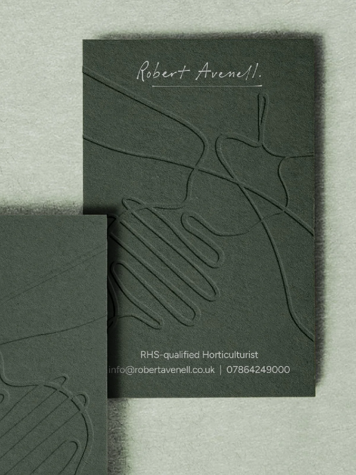
Robert Avenell is an RHS-qualified, award-winning horticulturist based in Guildford, Surrey, specialising in ecological planting design and rewilding. The project covered the full brand arc: competitor research, positioning, naming, strapline, visual identity, a full website, and printed materials.
New House Art Space
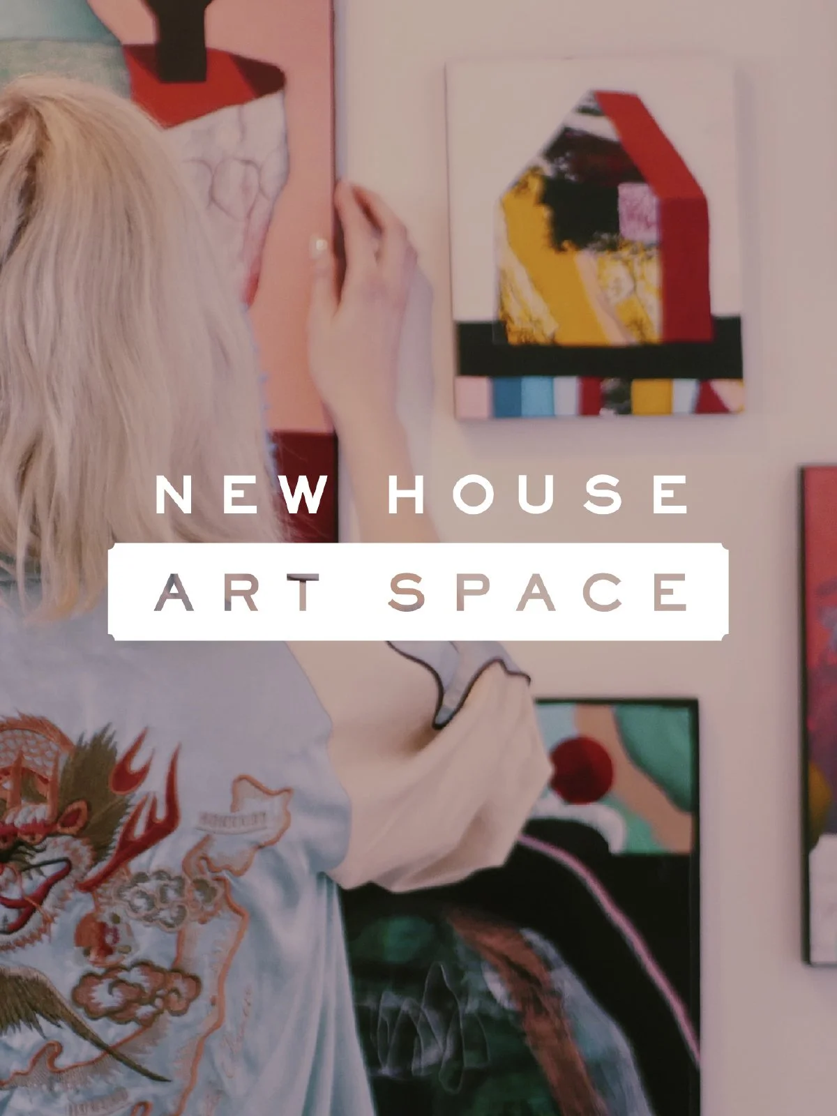
New House Art Space is a creative hub in the centre of Guildford, home to artist studios, a contemporary gallery and a rolling programme of exhibitions and events. The team needed a visual identity and website that could hold together many voices while keeping the character of the building and community.
The solution began with a flexible wordmark and typographic system inspired by the geometry of the building and the variety of work shown there. I collaborated with resident artists to create bespoke fonts, illustrations and graphic textures so the identity genuinely grew out of the community it represents.
On the website, clear navigation and bold use of imagery make it easy to explore studios, the gallery and upcoming events, while maintaining a consistent visual thread. The brand now gives New House a strong platform for marketing, wayfinding and event promotion across print, digital and within the building itself.
Wild Nutrition
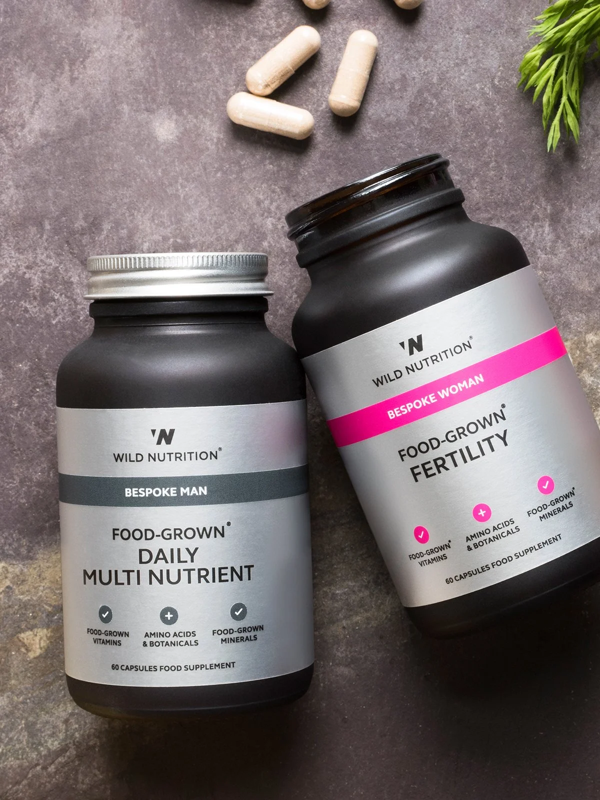
Wild Nutrition is an award-winning Food-Grown® supplements brand founded by nutritional therapist Henrietta Norton. They came to the studio at the very beginning of their journey, looking for a brand identity that would feel credible in the wellbeing space without slipping into clichés.
Working closely with the founders, I developed a visual identity system centred on calm, understated typography, a refined colour palette and tactile packaging that reflects the quality of the ingredients. The packaging and print materials were designed to feel like objects you want to hold on to – amber glass, clear hierarchy and generous whitespace – while still working hard on busy shelves and online listings.
Over time the work has expanded to include advertising, point of sale, printed literature and digital assets, keeping the brand coherent as the business has grown into new ranges and markets.
Modify
Modify provides coaching, programmes and resources to support personal development and behaviour change. The founder needed a brand that could carry quite complex subject matter in a way that felt structured, optimistic and grounded.
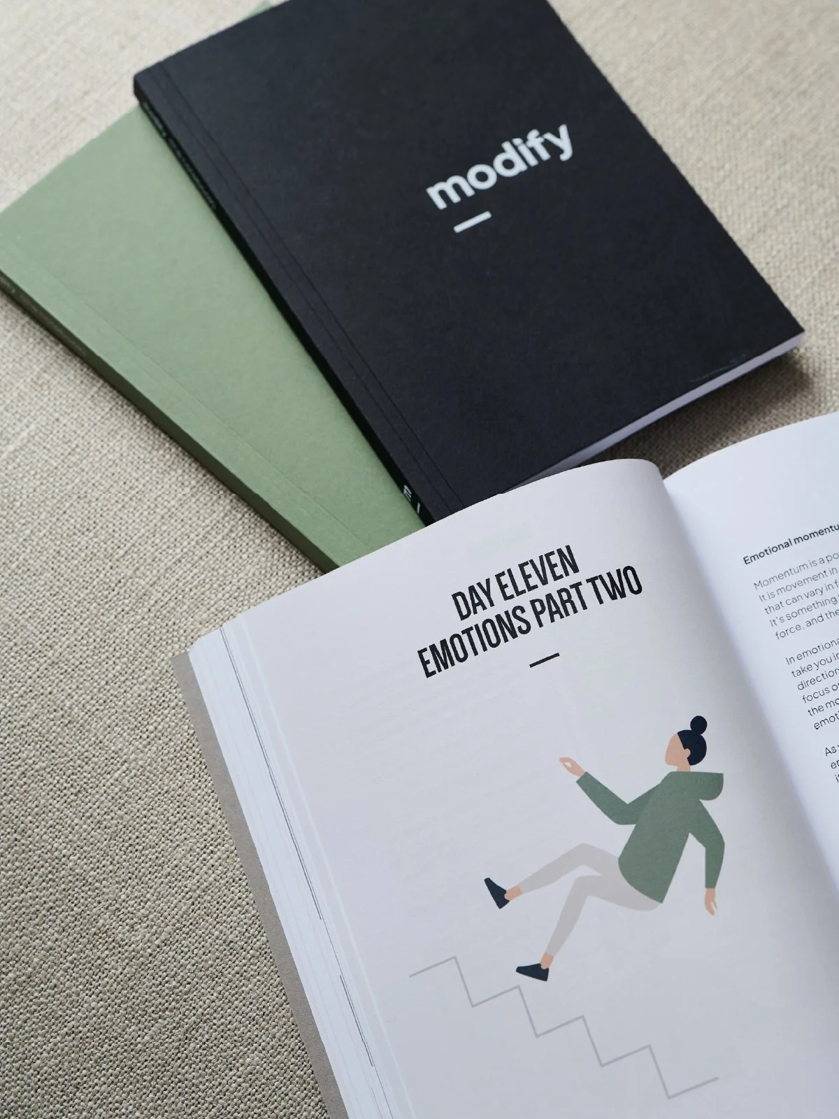
I developed a calm, typographic identity anchored by a distinctive wordmark and a system of coloured tabs and frames that echo the idea of editing and re-framing. This language carries through into a substantial 244-page workbook, notebooks, worksheets and a content-rich website.
The design emphasises clarity and usability: generous margins, clear hierarchy and simple diagrams make the material approachable, while cohesive visuals across print and digital give the brand a strong, professional presence.
Inka Distribution
Inka Distribution is a family owned distribution company specialising in natural and ethical brands across France and neighbouring territories.
Founded by Joselo Reyes Del Rio and Daniel Doguet, Inka brings together deep industry experience with a principled belief in the intelligence and power of nature. The business exists to support pioneering wellness brands, helping them reach people through trusted, meaningful and long term partnerships.
Human Diverse
Human Diverse is an organisation focused on people, inclusion and coaching. The brief was to create a brand that feels human and approachable, but still professional enough to sit comfortably in corporate and educational settings.
The identity uses a modular “H” symbol built from overlapping forms to suggest individuality within a shared structure, paired with clean typography and a soft, contemporary colour palette. Across stationery, social assets and web layouts the system flexes easily, allowing Human Diverse to dial the tone up or down depending on audience.
The result is a distinctive yet calm presence that helps them stand apart from generic “HR blue” brands, while still feeling trustworthy and clear.
Tom the Fish
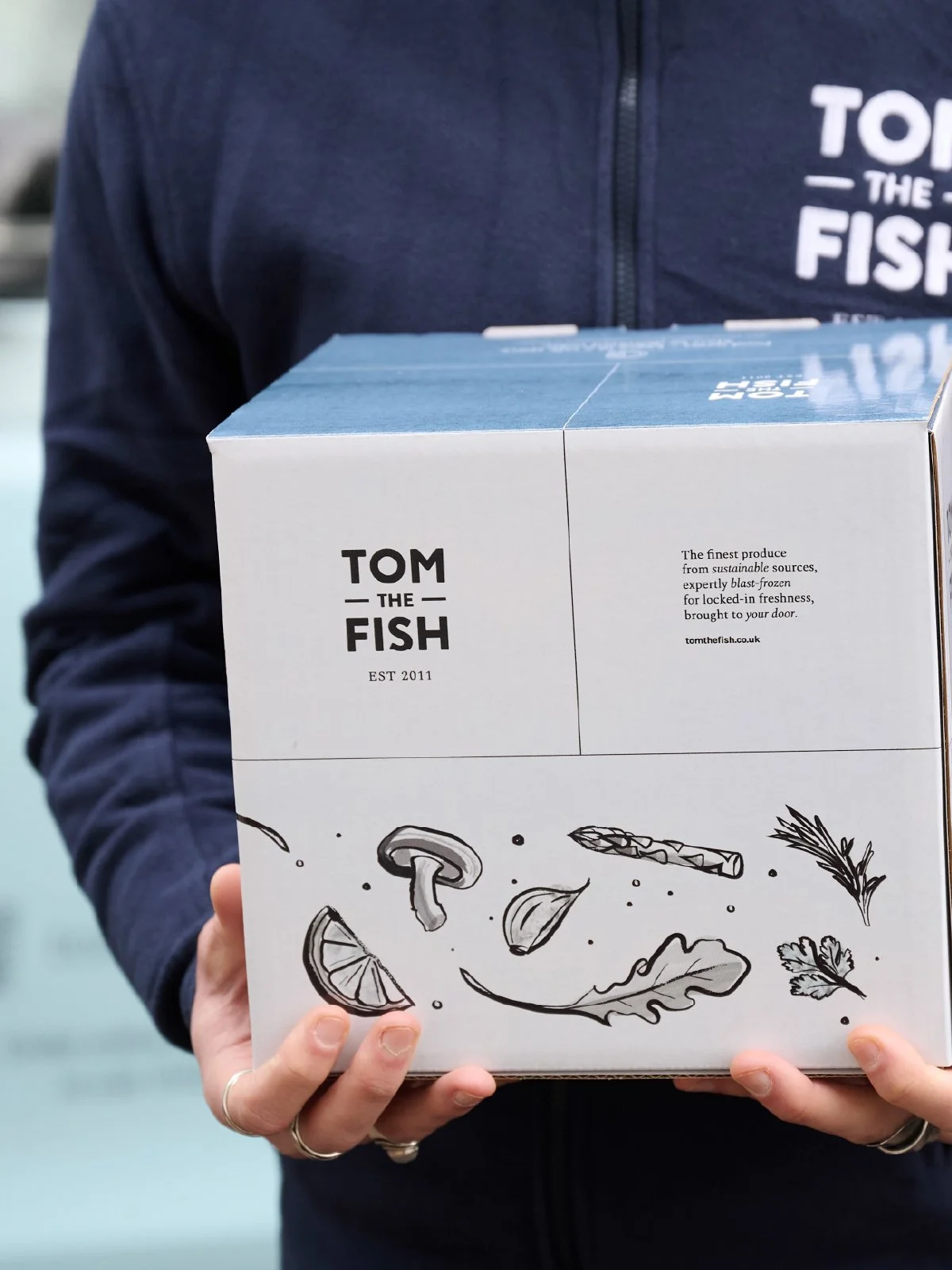
Tom The Fish is an independent frozen food brand specialising in high-quality fish, seafood and ready-to-cook dishes, delivered direct to customers’ freezers. The brief was to create a brand and e-commerce experience as polished and trustworthy as a premium supermarket, while retaining the warmth of a small, hands-on business.
I developed a confident visual identity and Shopify site focused on clarity, appetite appeal and ease of use. Ongoing work spans packaging, social content, email and seasonal campaigns, helping the brand grow while remaining distinctly Tom The Fish.
Deli Class
Deli Class is a family-run Italian deli, café and wine bar in Horsell, Woking, celebrating the food and wine of southern Italy. The team wanted a brand that captured the warmth and generosity of the deli, while giving them tools to promote events, catering and retail products.
The visual identity leans into classic Italian cues – expressive script typography, rich earthy colours and simple line illustrations – but keeps layouts contemporary and uncluttered. I designed menus, signage, printed promotions and a Squarespace e-commerce site that allows customers to order hampers and products online.
Together, these elements give Deli Class a distinctive presence both on the high street and online, reflecting the atmosphere of the space and helping them communicate consistently with their loyal local audience.
PrimaryMatters
PrimaryMatters works in the education space, providing resources and support for primary schools. The brand needed to feel trustworthy to school leaders and parents, while still having enough warmth and character to resonate with children.