
Selected Projects
A collection of branding, visual identity, and digital design projects developed for charities, start ups, and ambitious small businesses. Each project balances contemporary design with a practical, strategic foundation, helping organisations communicate clearly and grow with purpose.
New House Art Space
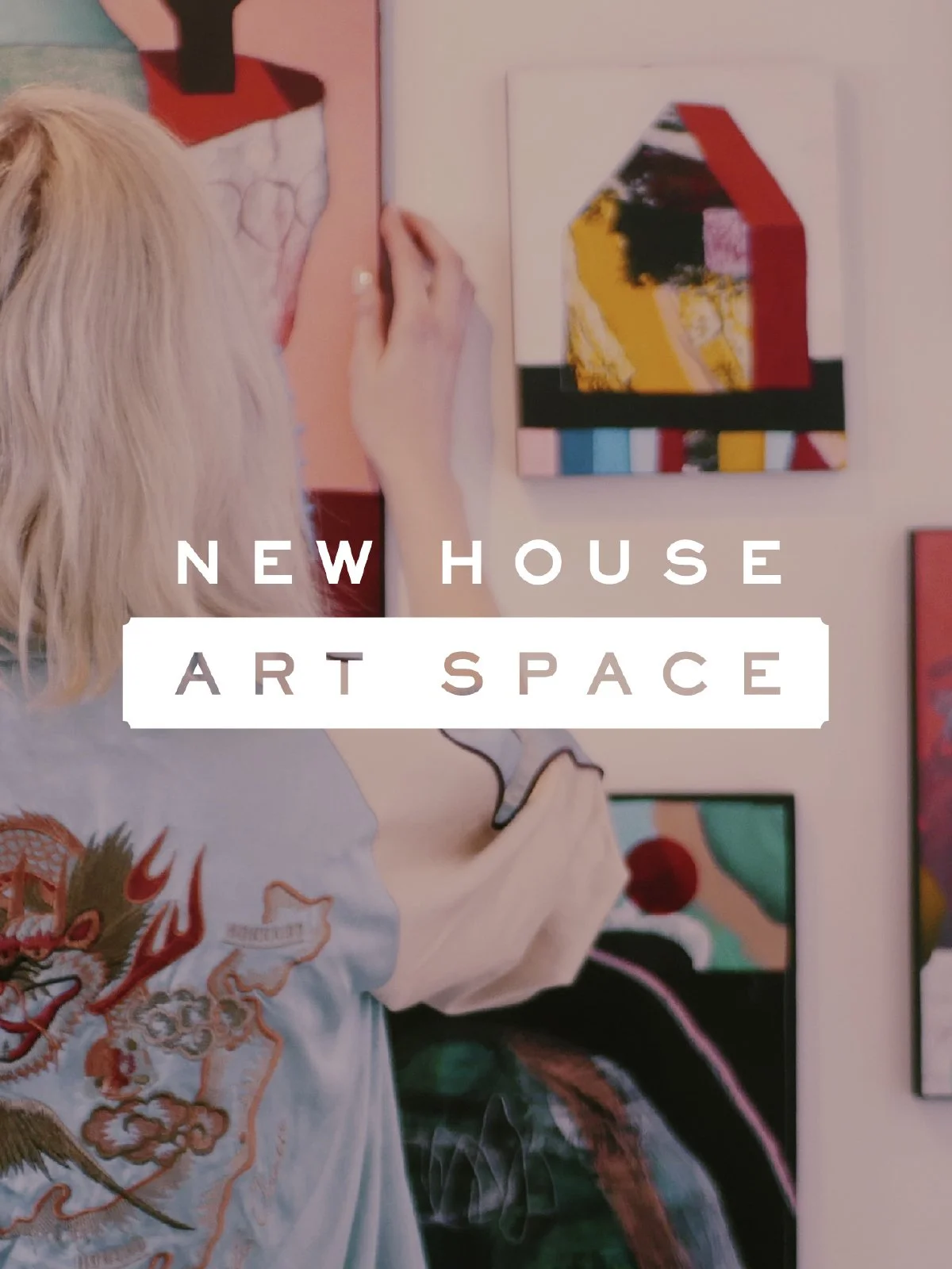
New House Art Space is a creative hub in the centre of Guildford, home to artist studios, a contemporary gallery and a rolling programme of exhibitions and events. The team needed a visual identity and website that could hold together many voices while keeping the character of the building and community.
The solution began with a flexible wordmark and typographic system inspired by the geometry of the building and the variety of work shown there. I collaborated with resident artists to create bespoke fonts, illustrations and graphic textures so the identity genuinely grew out of the community it represents.
On the website, clear navigation and bold use of imagery make it easy to explore studios, the gallery and upcoming events, while maintaining a consistent visual thread. The brand now gives New House a strong platform for marketing, wayfinding and event promotion across print, digital and within the building itself.
Modify
Modify provides coaching, programmes and resources to support personal development and behaviour change. The founder needed a brand that could carry quite complex subject matter in a way that felt structured, optimistic and grounded.
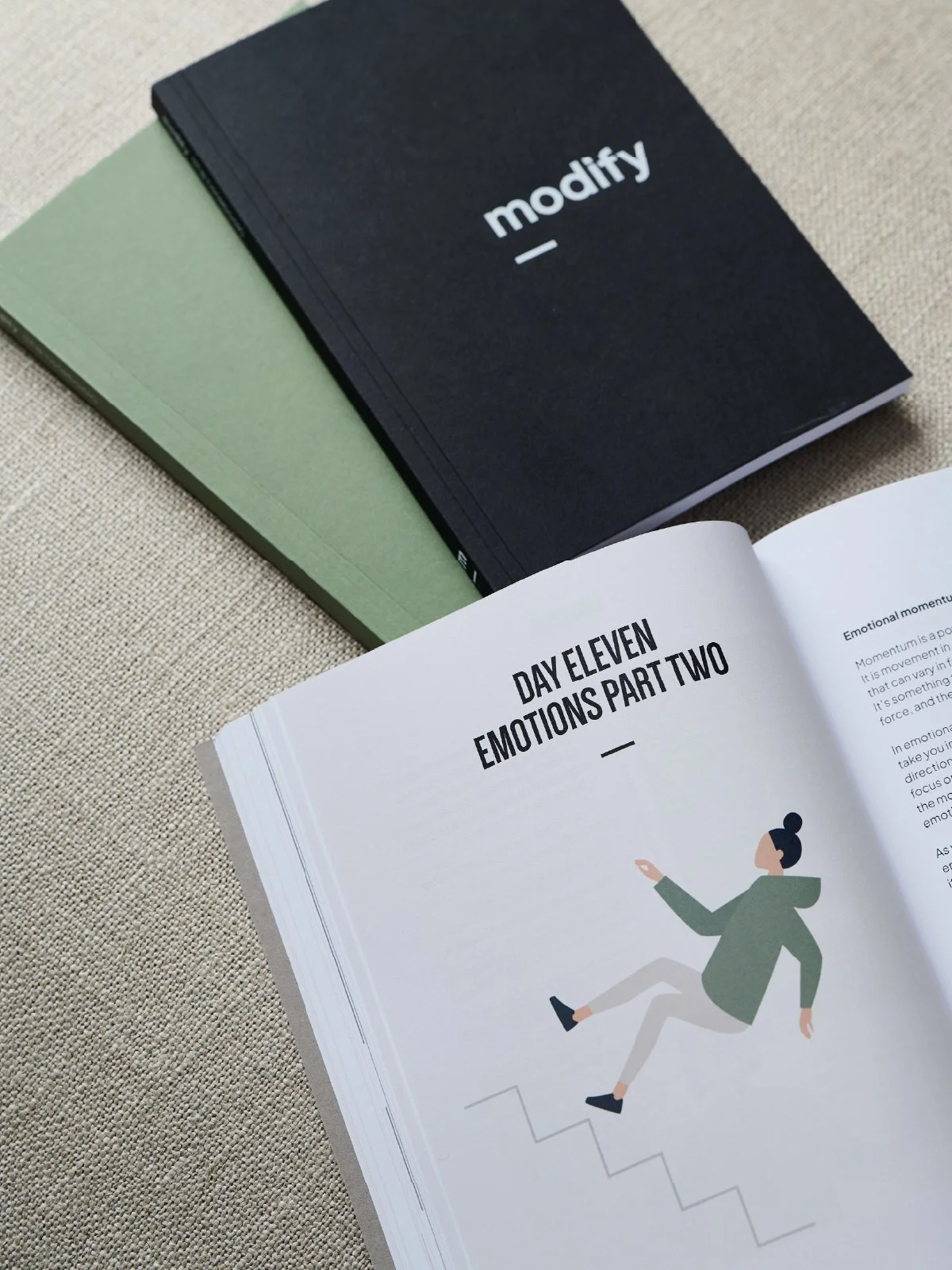
I developed a calm, typographic identity anchored by a distinctive wordmark and a system of coloured tabs and frames that echo the idea of editing and re-framing. This language carries through into a substantial 244-page workbook, notebooks, worksheets and a content-rich website.
The design emphasises clarity and usability: generous margins, clear hierarchy and simple diagrams make the material approachable, while cohesive visuals across print and digital give the brand a strong, professional presence.
At a Loss
AtaLoss is a UK-wide charity providing signposting and resources for people who have been bereaved, helping them find appropriate support wherever they live. They needed a coherent brand and website that could bring together a large amount of information for individuals, churches and partner organisations.
The identity for AtaLoss balances clarity and compassion: a clean logotype, soft but distinctive colour palette and simple graphic devices that gently guide the eye without overwhelming the content. Across printed materials, event resources, training packs and digital assets, the system keeps messaging consistent while allowing for different audiences and sub-brands such as Loss & Hope and The Bereavement Journey.
The website is designed as a practical hub, making it easy for users to search for local support, explore resources and understand next steps at their own pace.
The Bereavement Journey
The Bereavement Journey is a structured series of films and discussion groups designed to help adults process grief over seven sessions. The project required a website and visual materials that would feel safe, gentle and reassuring, while clearly explaining how the course works.
I created a quiet, supportive visual language using soft colour, generous whitespace and photography that focuses on human connection rather than clichés. The website is structured to guide visitors step by step: what the course is, who it is for, how to take part or run it, and how it connects with wider support from AtaLoss.
Throughout the process, tone of voice was as important as visuals, ensuring every piece of communication feels sensitive and respectful without becoming sombre or heavy.