TabTime
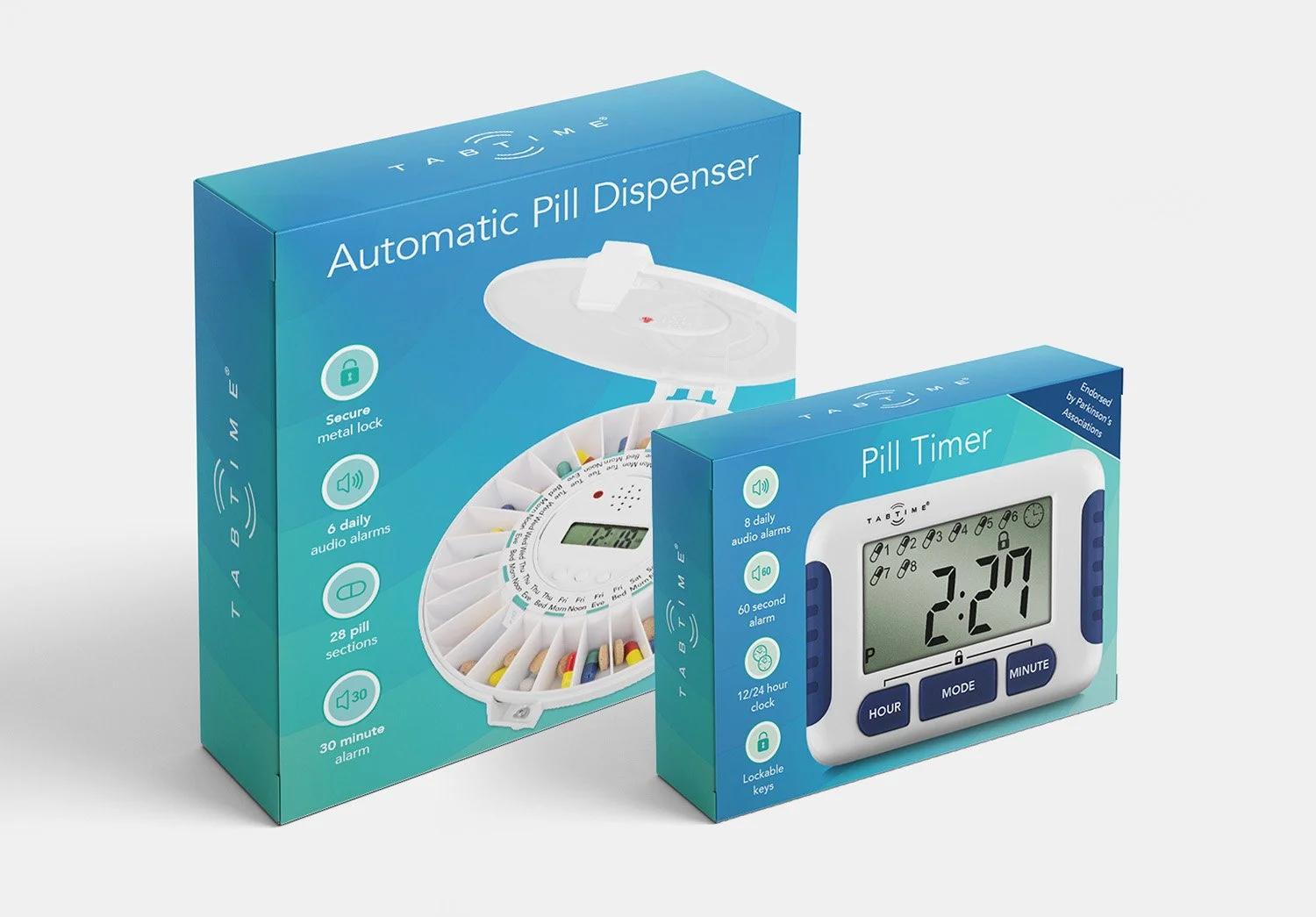
TabTime is a specialist in medication management products, including automatic pill dispensers, pill organisers and reminder devices that support people living with conditions such as dementia and Parkinson’s. The brief was to refresh packaging and product information so that it felt more approachable and intuitive for users and carers.
The design work focused on clear hierarchy, simple iconography and calm, accessible typography, ensuring people can quickly understand what each product does and how to use it. Instruction leaflets were redrawn with step-by-step diagrams and plain language, reducing cognitive load for users who may already be dealing with complex routines.
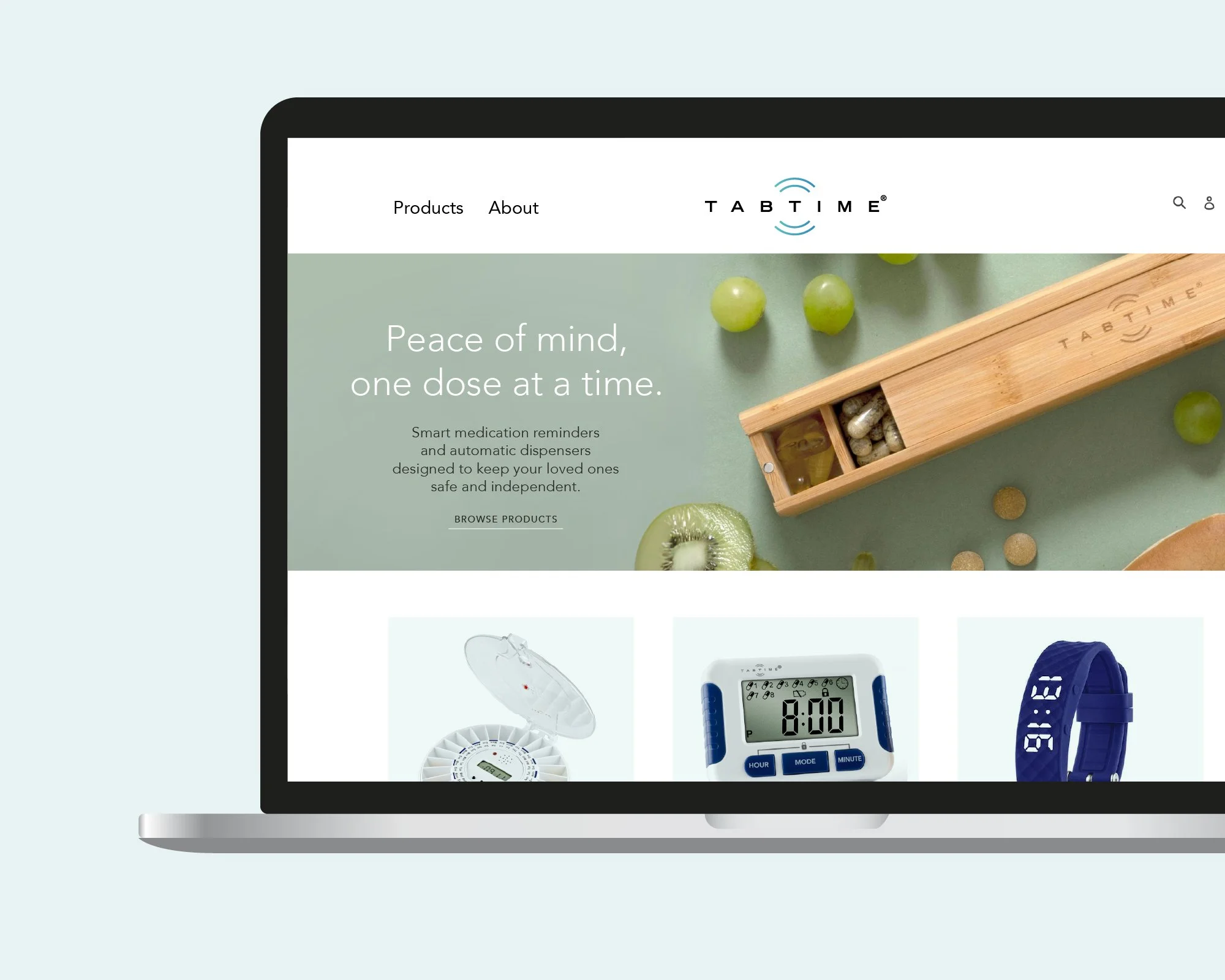
The result is a more cohesive product family that supports TabTime’s reputation for reliability and care, both on shelves and online.